
The best interface in gaming is the one a player never consciously notices. They read their health at a glance, navigate a menu without thinking about it, and understand exactly what a glowing outline means the first time they see it, all without a tutorial pop-up explaining any of it. Game UI UX design is the discipline responsible for that invisibility, and it is considerably more technical and considerably more load-bearing to a game’s success than the phrase “make it look nice” suggests to anyone outside the field.
Game UI UX Design, Defined
Game UI UX design covers the visual interface elements a player interacts with, menus, HUDs, inventory screens, and the underlying experience of how those elements communicate information and let a player act on it. UI, user interface, refers to the actual visual components. UX, user experience, refers to how intuitively and comfortably a player moves through and understands those components under real gameplay conditions. The two are inseparable in practice: a beautifully styled menu that confuses players is a UX failure regardless of how polished its visual design looks in isolation.
What distinguishes game UI/UX from general app or web design:
- Interfaces frequently need to function under time pressure, during combat or a timed challenge, rather than in the calm, deliberate browsing context most app design assumes.
- Multiple simultaneous input methods, touch, controller, keyboard, and mouse, often need to work within the same interface system.
- Visual feedback has to communicate feeling, weight, impact, urgency, alongside raw information, in a way a banking app interface never has to.
- The interface frequently needs to coexist visually with an active 3D or animated game world behind it, rather than sitting on a static background.
The Core Principle: Great Game UI Disappears
The single most important design philosophy in this field is that a genuinely great interface fades into the background of the player’s attention rather than demanding it. Cluttered, attention-grabbing UI pulls focus away from the actual gameplay the player came for, and the strongest interfaces earn player trust by showing exactly what is needed, exactly when it is needed, and nothing more.
A tiered approach to what information actually needs screen space:
| Tier | Examples | Visibility |
| Always visible | Health, ammo count, minimap when gameplay genuinely justifies it | Constant |
| Contextual | Interaction prompts, status effects, damage indicators | Appears when relevant |
| On-demand | Full inventory, detailed stats, complete map | Pulled up deliberately by the player |
Getting this tiering wrong in either direction causes real problems. Too much always-visible information creates visual noise that competes with the actual game world for attention. Too little contextual feedback leaves players confused about what just happened to them, why they took damage, why an action failed, without the game ever actually telling them.
Video Game UI: Diegetic, Non-Diegetic, and the Space Between
Video game UI generally falls into a small number of recognizable categories, and understanding the distinction matters because each approach carries real trade-offs between clarity and immersion that a design team needs to choose deliberately rather than by default.
The four core categories of game interface:
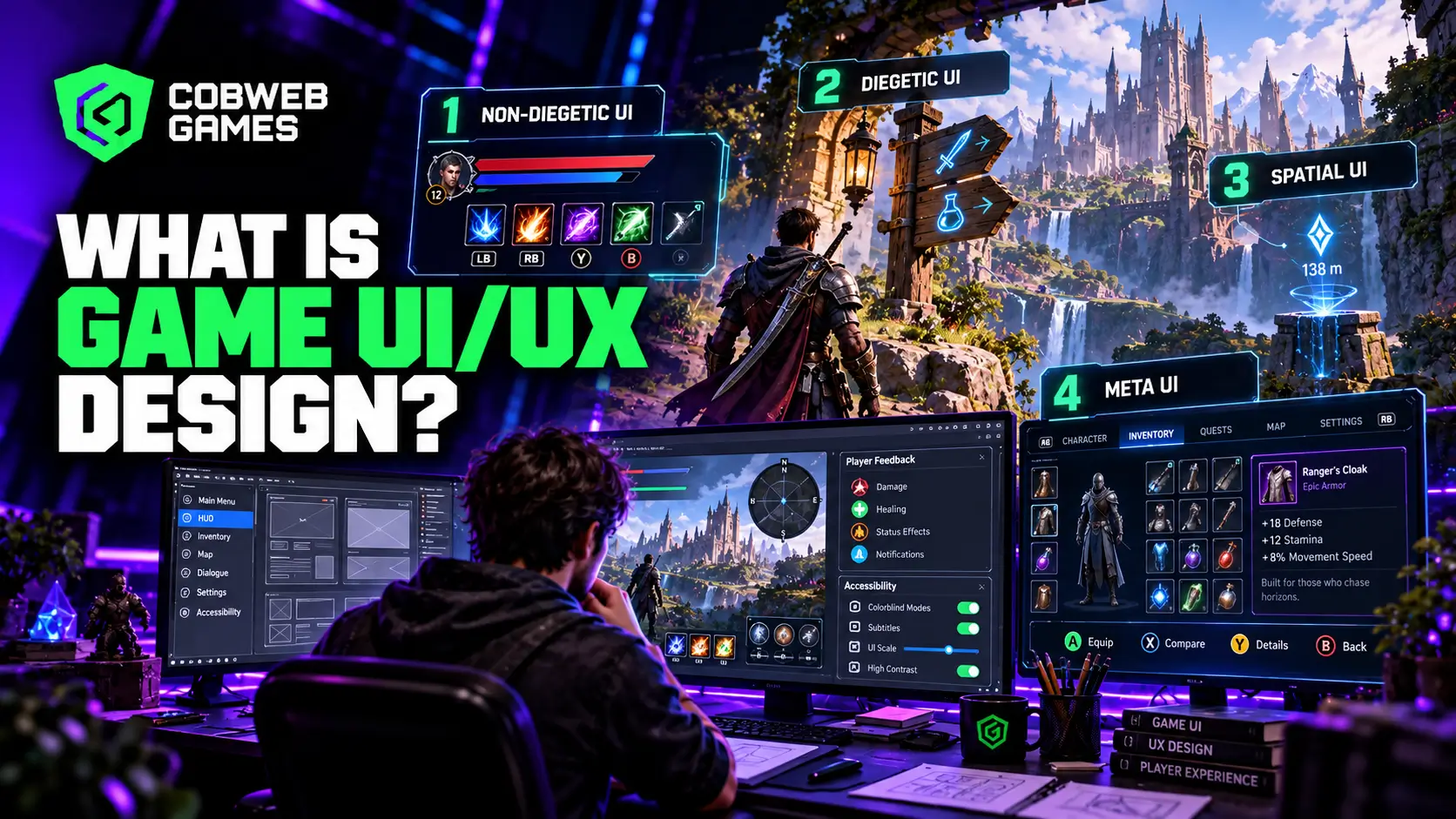
- Non-diegetic: traditional overlay elements that exist outside the game world entirely, a health bar or minimap sitting on top of the screen. Best suited to competitive and fast-paced action games where instant clarity matters more than immersion.
- Diegetic: interface elements that exist physically inside the game world itself, a character’s health displayed as a literal glowing spine on their back, a weapon’s ammo count visible on the gun model itself. This approach prioritizes immersion, pulling the player deeper into believing the world is real.
- Spatial UI: information attached to a specific location in the game world without being a literal object within it, a floating damage number above an enemy’s head, a waypoint marker hovering over a distant objective.
- Meta UI: a hybrid approach where the interface responds to what the character is experiencing, screen edges reddening as health drops, vision blurring under a status effect, balancing genuine information density with immersive feeling.
Choosing the right mix of these approaches for a specific game is one of the earliest and most consequential decisions a UI/UX designer makes, since retrofitting a competitive shooter’s clarity-first interface onto a slow, atmospheric horror game, or the reverse, tends to actively undermine what each genre is trying to accomplish.
Menu Navigation Patterns That Actually Work
Menu structure is where a lot of otherwise strong game UI/UX design quietly falls apart, since menus are judged less on visual polish and more on whether a player can find what they need without frustration.
Common menu navigation patterns and where each genuinely fits:
- Tab-based layouts work well for three to seven roughly equal, parallel sections, character stats, inventory, quest log, sitting alongside each other at the same navigational depth.
- Sidebars suit complex, hierarchical menu systems where a player needs to drill down through nested categories without losing their place.
- Radial wheels support fast, in-the-moment selection during active gameplay, a weapon or ability wheel that pauses or slows time briefly while the player chooses.
- Full-screen overlays handle genuinely complex systems, a detailed crafting screen or skill tree, that need real screen space to communicate properly.
A requirement that cuts across every one of these patterns: full controller navigation support with clear, visible focus indicators. A menu designed mouse-first with controller support bolted on afterward is one of the more common and most frustrating failures players actually report, since the navigation logic that feels natural with a cursor frequently breaks down entirely once translated to directional input.
Feedback Systems: The Difference Between Functional and Satisfying
Every meaningful player action needs a feedback loop, visual, audio, and ideally haptic, confirming that the action registered and communicating how it felt. The accumulated weight of these small feedback details is frequently called “juice” in game development circles, and it is the difference between an interaction that merely works and one that feels genuinely good to perform repeatedly.
Common feedback techniques and their typical scale:
- Hitstop: a brief one- to three-frame freeze on impact that gives a hit real weight without the player consciously noticing the pause.
- Screen shake: one to three pixels for a minor impact, five to ten pixels for a major one, calibrated carefully since overdone screen shake becomes disorienting rather than satisfying.
- Particle bursts: small visual effects triggered on interaction that confirm an action landed.
- Color flashing: a brief, sharp color change on an affected object that draws the eye to exactly what just happened.
This layer of design work is genuinely distinct from static visual interface design, and it overlaps heavily with the kind of expressive, feedback-driven work game animation teams bring to a project, since much of what makes an interaction feel satisfying is animated timing and motion, not just a static icon or color choice.
Player Experience and Accessibility as a Core Design Requirement
Player experience design has matured considerably in recent years, and accessibility is no longer treated as an optional add-on but as a baseline requirement that a genuinely modern interface has to satisfy from the start.
Accessibility considerations that belong in the initial design pass, not retrofitted later:
- Scalable subtitles with adjustable background opacity for legibility against varied scene content.
- Colorblind filter modes covering deuteranopia, protanopia, and tritanopia specifically.
- Font scaling ranging roughly from 0.75x to 2.0x to accommodate a wide range of visual needs.
- High contrast display modes for players with low vision.
- Full button remapping support, since a fixed control scheme genuinely excludes players who cannot use it as designed.
- Motion reduction options for players sensitive to camera shake or rapid visual effects.
Building these considerations in from the start is considerably cheaper than retrofitting them after a UI system is already locked, and a growing share of players actively favor titles that clearly invested in this area, which makes accessibility as much a commercial consideration as an ethical one.
Game Interface Design and the Engine It Actually Runs In
Game interface design does not exist purely as flat, standalone artwork; it has to function correctly inside a real engine’s rendering and input systems, which introduces technical constraints a purely visual designer working in isolation frequently underestimates.
Where interface design meets real engine constraints:
- UI rendering competes for the same frame budget as the rest of the game, so a visually heavy interface with excessive overdraw can measurably hurt performance.
- Resolution and aspect ratio scaling need to work correctly across everything from an ultrawide monitor to a small handheld screen without elements overlapping or disappearing.
- Localization changes text length dramatically across languages, and a UI locked to English string lengths routinely breaks once translated strings replace the originals.
- Animation and transition timing between UI states needs to feel responsive rather than sluggish, which is a genuine technical performance target, not just an aesthetic preference.
Studios working across Unity game development and Unreal Engine game development need interface designers who understand these engine-specific realities directly, rather than treating UI as generic artwork handed off to developers to somehow make functional after the fact. This is exactly why strong game art collaboration matters here too, since interface visuals need to share a coherent visual language with the rest of the game rather than looking like a separate system bolted on top.
Game UX Research: Testing With Real Players, Not Just the Design Team
Game UX work that never gets tested against real players outside the development team consistently misses problems an internal review simply cannot catch, since developers already know their own interface intuitively in a way a first-time player never will. Structured playtesting exists specifically to surface exactly this gap before it reaches launch.
What genuine game UX research typically covers:
- First-impressions testing, watching a completely new player navigate core menus with no prior context or explanation.
- Task-completion testing, timing how long it takes a player to find a specific item, equip a piece of gear, or complete a menu-driven objective.
- Think-aloud sessions, where a tester narrates their reasoning in real time, revealing exactly where confusion or hesitation actually occurs.
- Eye-tracking or heatmap data where available, confirming visual hierarchy is actually guiding attention the way the design intended.
A studio that skips this step and relies purely on internal team intuition routinely ships an interface that looks clean in review and confuses real players almost immediately, since the design team’s familiarity with their own systems makes it genuinely difficult to spot friction a first-time user hits within seconds. Building even a lightweight version of this testing loop into the schedule, a handful of fresh testers at two or three points during development, catches far more real usability problems than any number of additional internal design reviews ever will.
Video Game UI Across Genres: What Actually Changes
Video game UI requirements shift considerably by genre, and applying one genre’s interface conventions to a different genre without adjustment is a common source of player confusion. A strategy game’s information-dense interface would overwhelm a fast-paced action title, while an action game’s minimal HUD would leave a strategy player without the data they actually need to make good decisions.
How genre shapes interface requirements:
- Action and shooter games favor minimal, non-diegetic overlays that stay out of the way during fast-paced moments, prioritizing split-second clarity over visual richness.
- RPGs and strategy titles typically need denser information architecture, stat screens, inventory grids, and skill trees that players engage with more deliberately and for longer stretches.
- Narrative and horror games often lean toward diegetic or minimal UI specifically to protect immersion and atmosphere, sometimes deliberately withholding information a more conventional HUD would show.
- Mobile and casual games need touch-optimized interfaces with generously sized targets and simplified navigation suited to shorter, more interrupted play sessions.
Recognizing which category a project actually falls into, and resisting the temptation to import interface conventions wholesale from a different genre, is one of the earlier and more consequential decisions in any UI/UX design process.
Common Mistakes in Game UI/UX Design
Designing mouse-first and adding controller support as an afterthought. This consistently produces a navigation experience that feels broken on gamepad, since cursor-based interaction logic rarely translates cleanly to directional input.
Overloading the screen with always-visible information. Every additional persistent HUD element competes for the player’s limited attention, and most of what feels essential during design review turns out to be unnecessary once real players are actually focused on gameplay.
Providing no feedback for loading delays over roughly 200 milliseconds. A brief, unexplained pause reads as a bug or a freeze to a player, even when the game is functioning correctly behind the scenes.
Using touch targets smaller than roughly 44 by 44 pixels on mobile. Undersized tap targets are one of the most common sources of frustrated mis-taps on mobile interfaces specifically.
How Cobweb Games Approaches Game UI/UX Design?
Cobweb Games treats game UI/UX design as inseparable from the game’s actual engine, platform, and genre from the earliest concept stage, not a cosmetic layer applied once core systems are already finished. That means designing menu navigation, feedback systems, and accessibility support around how a specific game will actually be played, rather than adapting a generic interface template after the fact.
Frequently Asked Questions
What is the difference between game UI and game UX?
UI refers to the actual visual interface components, menus, HUDs, and buttons. UX refers to the overall experience of navigating and understanding those components during real gameplay. Strong UX requires strong UI, but polished UI alone does not guarantee good UX if the underlying navigation or information hierarchy is confusing.
Is diegetic UI always better than traditional overlay UI?
No. Diegetic UI supports immersion well but can sacrifice the instant clarity competitive and fast-paced games depend on. The right choice depends entirely on genre and pacing, and many successful games blend both approaches deliberately rather than committing exclusively to one.
Why does controller support matter even for a game primarily played on PC with mouse and keyboard?
A meaningful share of PC players use a controller by preference, and console ports or later platform expansions depend entirely on interface systems that were built with controller navigation in mind from the start rather than retrofitted under deadline pressure.
How early in development should accessibility features be planned?
As early as possible, ideally during the initial UI/UX design pass rather than after core systems are locked. Retrofitting colorblind support, remappable controls, or scalable text onto an already-built interface is considerably more expensive than designing for it from the start.
